
2025-08-17 @
Angular Material 20 - Recreating The [color] Attribute
Changelog:
2025-08-25: Made the toolbar example a bit more clear.
The [color] attribute
In older versions of Angular Material, several components came with a built in [color] attribute (in one form or another), which enabled easily setting the design of the given component, as long as you were fine with using some predefined styles.
Let’s take a look at Angular Material v16’s button component for example:
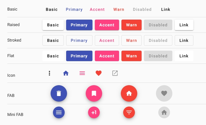
You could put color="primary" on a button or a toolbar for example, and the component would be istantly set to the primary colors of your theme. Same with color="accent" or color="warn".
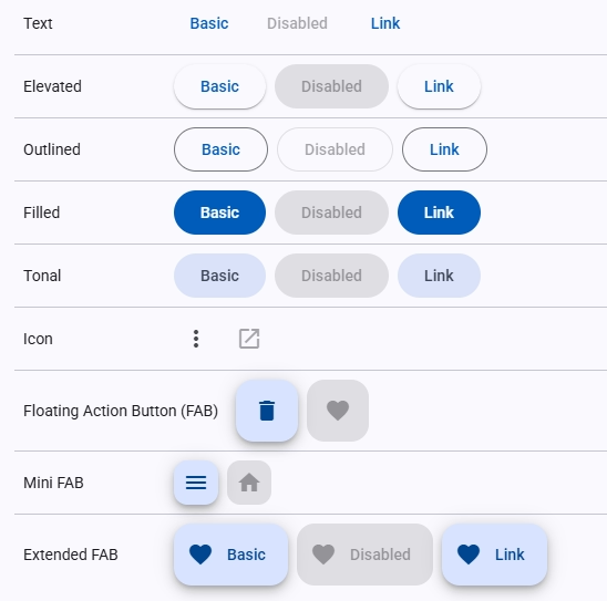
As of Angular Material 18 however, the color attribute only has an effect on the older, M2 themes and does nothing when it comes to M3. The new overview of the button component looks quite bleak. Without further context, if you were working with Angular Material and looked at the v20 overview page, which is the newest version at the time of writing this, you’d probably be really surprised.
Customizing the button in v20
I’ve wrote, at length, about how customizing and theming works in newer versions of Angular Material, so I’ll not go into that here and just leave a link to that post instead.
Anyway, bringing back the old color attribute’s functionality is surprisingly easy using the new mixins. All you have to do to achieve that, assuming you use the prebuilt color palettes and the azure palette is your primary palette, is defining some rules in your styles.scss:
@use '@angular/material' as mat;
[color="accent"] {
@include mat.theme((
color: mat.$rose-palette
))
}
[color="warn"] {
@include mat.theme((
color: mat.$red-palette
))
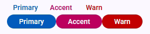
}Then you can just add the following buttons to your HTML:
<button matButton>
  Primary
</button>

<button matButton color="accent">
  Accent
</button>

<button matButton color="warn">
  Warn
</button>

<br>

<button matButton="filled">
  Primary
</button>

<button matButton="filled" color="accent">
  Accent
</button>

<button matButton="filled" color="warn">
  Warn
</button>
And you should get this outcome:
The colors do not exactly match the old ones, but you can create your own custom themes with the old colors or do it in a lot more finegrained way if you wish:
[matButton="filled"][color="accent"] {
  @include mat.button-overrides((
    filled-container-color: green,
    filled-label-text-color: white,
  ));
}
This approach will apply your specific colors to every filledmaterial button that has the accent color applied to it. However, one advantage of the approach above, is that it not only applies to your buttons, but to everything that supports the material theming. Meaning, if you want to create a toolbar that has the warn color, you can just create a fairly basic setup that uses the mat.toolbar-overrides mixin to set up the mat-toolbar to utilize the color variables and it works automatically. So soemthing like:
:root {
  @include mat.theme((
    color: mat.$azure-palette
  ));

  @include mat.toolbar-overrides((
    container-background-color: var(--mat-sys-primary),
    container-text-color: var(--mat-sys-on-primary),
  ));
}

[color="warn"] {
  @include mat.theme((
    color: mat.$red-palette
  ))
}
<mat-toolbar color="warn"></mat-toolbar>This way, the default colors for the toolbars globally become the --mat-sys-primary and mat-sys-on-primary colors, but you can easily change it any time you want to by adding the color attribute.
Newsletter
Sign up for my maybe monthly (not likely) newsletter for updates on new posts and other content.